


Overview
Resize the specific viewport of the window to 1:1, 16:9, and more.
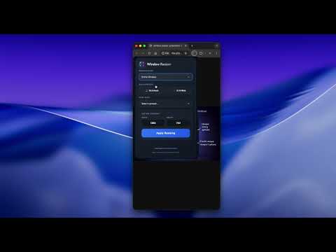
Window Resizer & Layout Tester Optimize your responsive design workflow with precision window resizing. Quickly test how your websites look across all screen resolutions with one click. This extension allows you to instantly resize your browser window to standard device dimensions or custom resolutions, ensuring your responsive layouts are pixel-perfect for mobile, tablet, and desktop. Key Features: Instant Presets: Switch between popular screen sizes for iPhone, Android, iPad, and Macbook. Custom Dimensions: Enter specific width and height values for tailored testing. Real-time Accuracy: Precisely resizes the viewport to simulate actual device display areas. Design Workflow Optimization: Perfect for developers and designers to verify CSS media queries and UI responsiveness on the fly. Stop guessing and start measuring. Ensure your web experience is consistent for every user, on every screen. Advanced Precision Controls: Beyond Simple Resizing What sets this extension apart is the level of control it gives you over the environment you're testing in. For professional developers, the difference of 15 pixels can break a design. Unique Advanced Options: Intelligent Scrollbar Control: Toggle between "With Scrollbars" and "Without Scrollbars" to see exactly how your content reflows. Test for the "layout shift" that occurs when scrollbars appear—a feature rarely found in standard resizers. Viewport vs. Whole Window: Choose whether to resize the entire browser frame or precisely target the internal content area (the viewport). This ensures your media queries are triggering on the exact pixel values they're designed for. Pure Viewport Extraction: Perfect for generating clean, distraction-free previews or design handoffs without the browser's UI getting in the way. Why it’s unique: Most resizers just stretch the window. This extension understands Responsive Context. By allowing you to suppress scrollbars and isolate the viewport, you can verify your break-points with 100% technical accuracy, simulating "Zero-G" layouts or specialized app-view environments effortlessly.
0 out of 5No ratings
Details
- Version1.0
- UpdatedDecember 30, 2025
- Size799KiB
- LanguagesEnglish
- DeveloperAnanda Success LLCWebsite
816 Skyline Rd Syemour, MO 65746 USEmail
anandasuccess@gmail.comPhone
+41 77 924 63 21 - TraderThis developer has identified itself as a trader per the definition from the European Union and committed to only offer products or services that comply with EU laws.
- D-U-N-S127415392
Privacy

This developer declares that your data is
- Not being sold to third parties, outside of the approved use cases
- Not being used or transferred for purposes that are unrelated to the item's core functionality
- Not being used or transferred to determine creditworthiness or for lending purposes
Support
For help with questions, suggestions, or problems, visit the developer's support site