


Overview
Pixefy is a powerful tool for responsive design testing and real-time web adjustments.
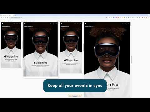
Instantly preview how your website adapts across multiple screen sizes in a single browser tab, making it easy to spot layout issues, refine designs with live editing, and ensure a great user experience on any device. 🚀 Key Features: ✅ Live Responsive Previews – See how your site adapts to various screen sizes in one view. ✅ Sync Interactions – Scroll, click, and navigate multiple views simultaneously for faster testing. ✅ User Agent Switching – Test how your site performs on different browsers and devices. ✅ Measurement Tools – Measure distances between elements for accurate layouts. ✅ Element Inspection & Editing – Modify text and images directly on the page for quick adjustments. ✅ Advanced Screenshots – Capture full pages, visible area or specific sections with one click. 💡 Help Us Improve! Pixefy is evolving, and your feedback is invaluable. Report bugs, suggest features, or share ideas: 👉 https://www.pixefy.io/feedback 🔍 Stay Updated: Check out new features & updates in our changelog: 👉 https://www.pixefy.io/changelog
4.8 out of 522 ratings
Google doesn't verify reviews. Learn more about results and reviews.
Details
- Version0.8.12 Open Beta
- UpdatedMarch 5, 2025
- Size902KiB
- LanguagesEnglish
- Developer
- Non-traderThis developer has not identified itself as a trader. For consumers in the European Union, please note that consumer rights do not apply to contracts between you and this developer.
Privacy
This developer declares that your data is
- Not being sold to third parties, outside of the approved use cases
- Not being used or transferred for purposes that are unrelated to the item's core functionality
- Not being used or transferred to determine creditworthiness or for lending purposes
Support
For help with questions, suggestions, or problems, please open this page on your desktop browser