


Overview
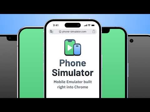
Try Phone Simulator - mobile view extension. Test your site on iPhone, iPad & Android: mobile view simulator & emulator.
Want to see your website in mobile view the way real users do? Phone Simulator is a Chrome mobile view extension that lets you test your site on iPhone, iPad, Android phones and tablets - instantly, directly in your browser. No extra software, no physical devices needed. How to get started: 1. Click "Add to Chrome" to install Phone Simulator. 2. Open any website you want to preview. 3. Click the extension icon and choose a device. 4. Instantly see your website on mobile - switch devices with one click. Key features of Phone Simulator: 📱 Test your site on mobile with 70+ device presets - smartphones, tablets, laptops, and more. 🍎 iPhone simulator online - preview iPhone 17, iPhone 18 Pro, iPhone Duo and more. 🤖 Android emulator - Samsung Galaxy S26, Galaxy S25, Google Pixel, Xiaomi, and other popular models. 🛠️ iPad emulator and Android tablet presets with precise screen dimensions. 🔄 Screen rotation - switch between portrait and landscape instantly. 📸 Screenshot capture - save any device preview instantly with one click. 🎥 Video recording - record your screen and export it instantly. 🌗 Dark & light mode testing across all devices and screen sizes. 🎨 Realistic browser UI with accurate mobile frames. 🔀 Side-by-side testing - compare multiple phones, tablets and laptops at once in real time. ✏️ Device builder - any screen size, any OS (iOS or Android), any color, custom User-Agent. ⚡ Instant device switching - no reloads, no DevTools required. 🌎 Works on any website - React, Vue, Angular, Bootstrap, Tailwind CSS. Perfect for: - Web developers testing responsive CSS and layouts on real device sizes. - UI/UX designers building mobile-first and adaptive websites. - QA testers running cross-device compatibility checks. - Agencies presenting a mobile view of website to clients. - Frontend developers debugging breakpoints. 🖥️ Accurate mobile viewer: Phone Simulator delivers real device viewport sizes, pixel ratios, and frames - so you see your website exactly as real users do. No guessing, no approximations. Whether you need a quick phone simulator online check during development or thorough mobile view testing for QA, this Chrome extension handles everything without leaving your browser tab. 📌 Supported device categories: 1️⃣ iPhone simulator - all major Apple iPhone models, from older to the latest releases. 2️⃣ iPad emulator - full iPad, iPad Air, and iPad Pro lineup. 3️⃣ Android phone simulator - mobile view for Samsung Galaxy, Google Pixel, and more. 4️⃣ Android tablet emulator - popular Android tablet screen sizes. 5️⃣ Laptop simulator - MacBook and Windows laptop viewports. 🎯 Ideal for every use case: 🛠️ Development & testing - test responsive CSS, media queries, and breakpoints via mobile simulator extension without a physical device. 📐 Design review - preview layouts on a cell phone simulator before handoff and catch issues early. 🔍 QA & cross-device - run phone emulator checks across iPhone, Android, and tablet presets to find layout bugs before users do. 📊 Client presentations - let clients see the mobile view of your website directly in Chrome, no extra tools needed. Phone Simulator gives you full access from the start. After a few launches, Unlimited keeps it going - every device, up to 8 at once, custom device builder, HD recording, unlimited exports, and advanced settings. Why developers choose Phone Simulator: ➤ Works instantly - no Chrome DevTools needed. ➤ Accurate cell phone simulator - real device dimensions. ➤ Online mobile emulator - works on any public URL or localhost. ➤ One-click mobile view extension - enable or disable instantly. ➤ Regular updates with new device models. 💬 Frequently Asked Questions: ❓ What is Phone Simulator? 💡 Phone Simulator is a chrome mobile view extension that lets you view any website as it appears on iPhone, iPad, Android, and other devices - right inside your browser. ❓ How do I test my website view on mobile? 💡 Install the extension, open any website, click the icon, and select a device. Your mobile website viewer is ready instantly - no configuration needed. ❓ Is it a real phone emulator? 💡 Yes. Phone Simulator emulates real device viewports, user-agent headers, and pixel ratios, giving you a precise online mobile simulator experience inside Chrome. ❓ Does it work as an iPhone simulator online? 💡 Absolutely. Pick any iPhone model from the device list and instantly see your site on mobile with a realistic browser UI and accurate screen dimensions. ❓ Can I test on Android too? 💡 Yes - Android presets include Samsung Galaxy, Google Pixel, Xiaomi, Infinix, OnePlus, and more. Use it as an online phone simulator for any Android screen size. ❓ What makes it different from Chrome DevTools device mode? 💡 Phone Simulator adds realistic frames, a mobile browser UI overlay, one-click screenshot capture, and fast device switching - all without opening DevTools. 📌 No extra software. No configuration. Just click, pick a device, and see your website in mobile view exactly as your users do. 👆 Click "Add to Chrome" and start mobile responsive testing right now.
4.5 out of 5266 ratings
Details
- Version2.6.0.2
- UpdatedOctober 6, 2026
- FeaturesOffers in-app purchases
- Size1.6MiB
- Languages53 languages
- DeveloperWebsite
Email
mpademirov@gmail.com - Non-traderThis developer has not identified itself as a trader. For consumers in the European Union, please note that consumer rights do not apply to contracts between you and this developer.
Privacy

Phone Simulator - Mobile View has disclosed the following information regarding the collection and usage of your data. More detailed information can be found in the developer's privacy policy.
Phone Simulator - Mobile View handles the following:
This developer declares that your data is
- Not being sold to third parties, outside of the approved use cases
- Not being used or transferred for purposes that are unrelated to the item's core functionality
- Not being used or transferred to determine creditworthiness or for lending purposes
Support
For help with questions, suggestions, or problems, please open this page on your desktop browser