

Mobile View Tester: Responsive Web Design Tool
7 ratings
)
Overview
Mobile-first design validation. Quickly preview and optimize website performance across multiple device screen sizes.
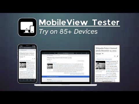
Transform Your Web Design with Precision Mobile Device Testing In today's mobile-first world, ensuring your website looks perfect across all devices is crucial. Mobile View Tester is the ultimate Chrome extension that empowers web developers, designers, and digital professionals to create flawless responsive websites with ease. Why Mobile View Tester? Comprehensive Mobile Device Simulation Our powerful tool provides instant, accurate previews of your website across a wide range of mobile devices. From the latest smartphones to tablets, see exactly how your design performs in real-world conditions. No more guesswork or multiple device testing – get comprehensive insights with a single click. Key Features: Instant Preview of 85+ Devices Supports iPhone, Android, and Tablet ,Laptop Screens Accurate Screen Resolution Simulation One-Click Device View Switching No Technical Setup Required Designed for Professionals Whether you're a web developer, UI/UX designer, freelancer, or part of a digital agency, Mobile View Tester streamlines your responsive design workflow. Catch layout issues before they reach your users, ensuring a seamless mobile experience. How It Works: Install the Chrome Extension Open Your Website Select From 85+ Device Profiles Instantly Validate Your Design Performance Optimization Lightweight and Fast Minimal Browser Resource Usage No External Software Needed Works Directly in Chrome Privacy and Security 100% Browser-Based No Data Collection Secure Testing Environment Perfect For: Web Developers UI/UX Designers Digital Agencies Freelance Professionals Quality Assurance Teams
3.6 out of 57 ratings
Details
- Version1.1.1
- UpdatedApril 28, 2025
- Size65.88KiB
- Languages19 languages
- Developer
Email
hritikkumarkota@gmail.com - Non-traderThis developer has not identified itself as a trader. For consumers in the European Union, please note that consumer rights do not apply to contracts between you and this developer.
Privacy

This developer declares that your data is
- Not being sold to third parties, outside of the approved use cases
- Not being used or transferred for purposes that are unrelated to the item's core functionality
- Not being used or transferred to determine creditworthiness or for lending purposes
Support
For help with questions, suggestions, or problems, visit the developer's support site