


개요
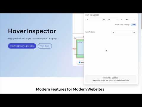
Inspector is the tool which mimic display dimension between selected and hover element. It would be good for designers, QA
version 3.1.1 - fix bugs, - - fix esc key press behavior - - fix formation css rule - - fix popup display position - add hovered element version 3.1.0 - update UI - add new features - prepare project to new features version 3.0.2 - fix bug: prevent click(thanks Marcelo Alejandro) - add background rule permission for save setting version 3.0.1 - fix bug: extension dropped (thanks @invisioN7) version 3.0.0 - refactor core(prepare for the new features) - add sidebar (setting, more details of selected element) - add freezing selected element after 2 click - press 'space' for unfreeze selected element - add link to discord - add uninstall form - fixed calculation position of popup version 2.0.0 - used ReactJS (expected simplifying of maintain and support) - add data: padding, margin, font, color, background, line-height, class, id - fixed calculation position of popup version 1.1.0 - add highline padding(green color) and margin(orange color). - fix bugs version 1.0.5.1 - minify file for more faster loading version 1.0.5 - add top bar with styles(padding, margin, font-size, height, width) for hover and selected element - fixed bugs (when user scroll label and lines position not display correctly) - add change style for label which display height and width hovered element - change active and regular icon: - add 2 hotkeys: -- command + enter / ctrl + enter - for hide/show topbar -- esc for close extension version 1.0.4 - add functionality when start scroll - change color of labels - add dimension calculating when selected located in hovered element version 1.0.3 - add dimension calculating when hovered located outside selected element
5점 만점에 4.8점평점 32개
세부정보
- 버전3.1.1
- 업데이트됨2025년 6월 3일
- 제공Liubomyr Kozak
- 크기429KiB
- 언어English
- 개발자
이메일
liubomyr.kozak@gmail.com - 비판매자판매자로 식별되지 않은 개발자입니다. 유럽 연합에 거주하는 소비자의 경우, 이 개발자와 체결한 계약에 대해서는 소비자 권리가 적용되지 않을 수 있음을 유의해야 합니다.
개인정보 보호
Hover inspector like in Zeplin , Figma에서 데이터 수집 및 사용과 관련하여 다음 정보를 공개했습니다. 더 자세한 정보는 개발자의 privacy policy을 참고하세요.
Hover inspector like in Zeplin , Figma 항목은 다음을 처리합니다.
개발자가 사용자 데이터에 관해 다음과 같이 선언했습니다
- 승인된 사용 사례를 제외하고 서드 파티에 판매하지 않음
- 항목의 핵심 기능과 관련 없는 목적으로 사용하거나 전송하지 않음
- 신용도 판단 또는 대출 목적으로 사용하거나 전송하지 않음
지원
질문, 제안 또는 문제와 관련하여 도움이 필요하면 데스크톱 브라우저에서 이 페이지를 여세요.