


نمای کلی
FROONT is a web-based design tool that runs in the browser and makes responsive web design accessible to everyone
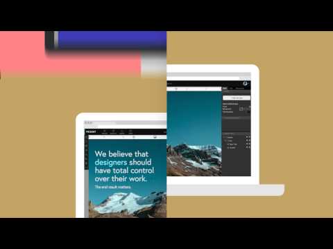
The multi-device age is here. The problem is, most people are still designing for all devices one-by-one in Photoshop. First you make the desktop version, then the mobile, then the tablet version. Existing visual editors for the web either aren't responsive, give little space for customization or lock you into templates. With the super user-friendly drag and drop interface anyone can create web design that works just as well on tiny mobile screens as on large cinema displays, no coding skills necessary. FROONT makes responsive web design visual. Design can be done in-browser with intuitive drag-and-drop tools. After all, humans judge design with their eyes therefore it seems just normal to see right away how designs will look across all different screen sizes. Each project has its own URL, that makes it easy to test the designs on real devices right away.
۴٫۴ از ۵۸ ردهبندی
جزئیات
- نسخه1.0.1
- تاریخ بهروزرسانی۲۴ مهر ۱۳۹۳
- اندازه10.37KiB
- زبانهاEnglish
- توسعهدهنده
- غیرتاجراین توسعهدهنده خودش را بهعنوان فروشنده معرفی نکرده است. اگر مصرفکنندهای در اتحادیه اروپا هستید لطفاً توجه داشته باشید که حقوق مصرفکننده برای قراردادهای میان شما و این توسعهدهنده اعمال نمیشود.
حریم خصوصی

پشتیبانی
برای دریافت راهنمایی درباره سؤالها، پیشنهادها، یا مشکلات، از سایت پشتیبانی توسعهدهنده بازدید کنید