

Overview
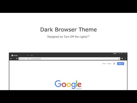
The best dark Chrome theme for your web browser. It's simple and coherent.
It's one beautiful dark theme (dark skin) for your Chrome web browser. It's simple and coherent that with the Turn Off the Lights Browser extension style. Here the high quality theme use not the shining black as background and frame color. Because this reflects everything back to you. That is why this darkness theme is a 80% black, this extend with the same dark color as the light off layer in the Turn Off the Lights Browser extension. This dark mode theme is very convenient for eye strain during the night. To learn more go to: https://www.turnoffthelights.com/browser/ If you like, feel free to buy us a coffee! https://www.turnoffthelights.com/donate/ Download darkness theme now in your Google Chrome web browser! Don't forget to like & Follow Us: Facebook https://www.facebook.com/turnoffthelight X https://twitter.com/TurnOfftheLight Pinterest https://www.pinterest.com/turnoffthelight Instagram https://www.instagram.com/turnoffthelights YouTube https://www.youtube.com/@turnoffthelights How to remove/uninstall a Chrome theme in your Chrome web browser: 1. On your computer, open Chrome. 2. At the top right, click More and then Settings. 3. Under "Appearance", click Reset to default. You will see the classic Google Chrome theme again. <<< Option feature >>> To protect your eyes at night and to get focus on the video player such as YouTube™. It's recommend to use and install the Turn Off the Lights for YouTube and Beyond https://chrome.google.com/webstore/detail/bfbmjmiodbnnpllbbbfblcplfjjepjdn
3.7 out of 53K ratings
Google doesn't verify reviews. Learn more about results and reviews.
Details
- Version1.0.7.0
- UpdatedJanuary 24, 2024
- Size37.97KiB
- Languages55 languages
- DeveloperStefan vdWebsite
github.com/turnoffthelights github.com/stefanvd Antwerp 2000 BEEmail
support@stefanvd.net - Non-traderThis developer has not identified itself as a trader. For consumers in the European Union, please note that consumer rights do not apply to contracts between you and this developer.
Support
For help with questions, suggestions, or problems, visit the developer's support site
