


總覽
Test your responsive designs on multiple devices at once.
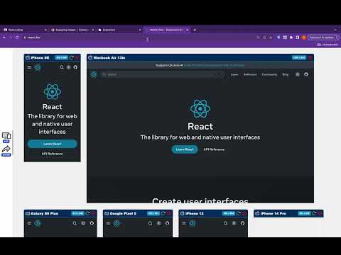
See your website on multiple devices at once with live updates, even for locally hosted sites. Hot module reloading ensures instant code changes across all devices, while synchronised scrolling and navigation lets you test seamlessly across any website. Perfect for: ----- ✅ Full-Stack & Front-End Developers ✅ UX/UI Designers ✅ Anyone using Polypane/Blisk/Responsively/Sizzy Get started in seconds: ----- ✅ Install Mobile View from the Chrome Web Store. ✅ Click the extension icon to activate it. ✅ Select devices and breakpoints for continuous testing. ✅ Start developing - changes appear instantly! Join the future of responsive design testing and quality assurance. Works with all your favourite frameworks. Try Mobile View today and revolutionise your development process!
4.3 分 (滿分 5 分)38 個評分
詳細資料
隱私權

這位開發者就你的資料做出下列聲明:
- 除經核准的用途外,不會將你的資料販售給第三方
- 不會基於與商品核心功能無關的目的,使用或轉移資料
- 不會為了確認信用度或基於貸款目的,使用或轉移資料
支援
如有疑問或建議,請前往開發人員的支援網站