

Bubble Editor Powerup from Codeless Love

Overview
Enhances the Bubble Editor with toggleable features (not affiliated with Bubble).
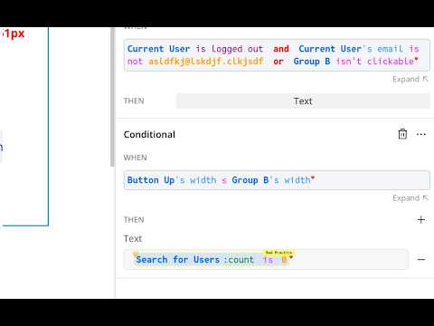
This extension enhances your Bubble.io editor and improves the UI. It's free to use and maintained by the Bubble community at Codeless Love! You can contribute to the source here: https://github.com/codeless-love/Bubble-Editor-Powerup To toggle features on and off, click the puzzle piece in your browser extension menu, find the Codeless Love Powerup plugin, and pin it using the pin icon. This makes it visible in your browser menu. Then, click on the Powerup icon and select the features you want to turn on and off with the checkboxes. --- # Bubble Editor Powerup Features This document lists all available features in the Bubble Editor Powerup extension, organized by category, along with a brief description for each. --- ## Branches ### Tab Naming Automatically renames the Chrome tab to display the current branch name from the version URL parameter. Makes it easier to identify which branch you're working on when multiple editor tabs are open. ### Discourage Edits in Main When you're on Main, dim the main window and add a red banner at the top of the page. The app is still technically editable. ### Block Edits in Main Attempt to completely hide most functionality when you're in the Main branch. Logs and General tab are still visible. ### Bulk Branch Delete Provides a quick way to delete multiple branches at once from the extension popup. Access this feature by clicking the extension icon while in a Bubble editor. ### Create and delete branches inline. Adds a three-dot menu to each branch in the version control panel, allowing you to quickly create or delete branches directly from the Bubble editor interface without leaving the current branch. ## Data View ### Clickable Checkbox Labels In Privacy Rules, make checkbox labels clickable, allowing you to toggle checkboxes by clicking on their labels instead of just the checkbox itself. ### Maximum Sized Option Set Inputs On the option set tab of the Data view, stretch Option Set inputs to be as wide as possible for your screen so that content is not cut off. ### Maximum Sized Data Type Inputs On the Data type view, stretch inputs to be as wide as possible for your screen so that content is not cut off. ### OS Limitless Attribute Lists On the option set tab of the Data view, allow attribute lists to grow as tall as they want, with no scorlling. ### Option Set Move Gaps On the option set tab of the Data view, add a gap to the top item where 'move up' normally is, so that everything else is in line. Do the same at the bottom for 'move down'. ### Color indicators when copying database When copying the database, make the button and description different colors depending on which direction data is moving. Red for to live, green for to dev. The green color, importantly, prevents accidents if the plugin is unexpectedly turned off without realizing. ## Design Canvas ### Left Align the Design Canvas Left aligns the content of your page in the editor to free up space on the right-hand side for Property Editors and other menus. ### Elements Tree Row Height Customize the height of elements tree rows in the Bubble editor. Default is 32px, but you can set a custom height in pixels. ## Editor Styling ### Maximize the expanded App Interface Manager dropdown menu When the pp Interface Manager (AIM) menu is expanded, make it take up as much space as possible, and prevent long page/RU names from being cut off. ### Dark Mode Applies a dark mode theme to the Bubble editor. Automatically follows your system or browser dark mode settings. ## Expression Composers ### Increase Text Hitbox Size in Expression Composers In expression composers which have static text (nondynamic), make the clickable area for the text as big as it can be, so you can easily click it. ### Full Width Expression Composers Make the composer box for expressions full width in places where it isn't already (e.g. element condition tab) to let you see more of the expression at once without wrapping. ### Resize Expression Dropdown Sometimes your data types have a long name. Now you can resize the dropdown to see them. ## Expressions ### Rename Arbitrary Text Save your Arbitrary Text expressions with a name that appears in the expression. ### Expression Syntax Highlighting This feature provides enhanced syntax highlighting for expressions within the Bubble editor, making it easier to read, understand, and debug your application logic. ### Bad Practice Warning Highlights bad practices in expressions and provides a link to documentation explaining best practices. ### Warn about ':count is 0' pattern Highlights when the ':count is 0' pattern is used instead of the more efficient 'is empty' check. ### Warn about 'Current User' in backend workflows Highlights when 'Current User' is used in backend workflows, which can cause issues. ### Public API Warning Shows a warning when a workflow is exposed as a public API ### Zero Width Warning Warn when an element's max-width is set to 0 ### Multiline Expressions Make expressions multiple lines, indented, and collapsible. ### Collapse and expand subexpressions Allow expanding and collapsing parts of the expression for clarity. Requires multiline expressions. ## Merge ### Stalled Merge Detector Sometimes merges stall on load. This detects that and provides help for fixing the issue. ## Notifications ### What's New Notification Shows a one-time notification after an extension update to highlight new features. This message is only shown once per update. ## Privacy ### Privacy Status Badges Styles privacy buttons and text elements as colored badges: red badge for 'Publicly visible' and green badge for 'Privacy rules applied' to clearly indicate privacy status. ## Property Editor - Unreleased ### Caption Overflow Fix Prevent the name ('caption') of properties in the Element Property Editor from overflowing onto the next item. ## Runtime ### Enable Runtime Features (Beta) Enable powerup features for runtime (a.k.a. preview mode). You will need to grant permission for each custom domain from the extension in runtime. Some features are only available in debug_mode. Note: this feature is in Beta. Please report bugs on the Codeless Love slack group or GitHub repository! ### Element Explorer (Beta) Click on any element on the page in Runtime (preview mode with debugger on) to see information about it, it's parent, children, and which reusable it is in. Navigate up and down the element tree, and open the editor directly to any given element. Note: only functions in debug_mode. Note: this feature is in Beta. Please report bugs on the Codeless Love slack group or GitHub repository! ### Enter Debug Mode During runtime, easily enter Debug Mode from the popup menu. ## Search Palette Bookmark ### Highlight Current Search Result Adds visual feedback to show which search result was last clicked in the search palette. ## Style Tab ### Hi-light style variable rows on hover When hovering over font and color variables, change the background of that row to a darker color so you can tell what row you are hovering. ### Hide Heart Indicators Hides all heart (❤️) indicators that the extension adds to show which elements have been modified. This provides a cleaner interface without the visual indicators. ## Workflow View ### Wrap Actions Left-to-Right When viewing a workflow's actions, this displays the actions in a left-to-right view instead of a vertically stacked view. NOTE: This only works in the 'Default' view, and not with the 'Compact' view. ### Increase Workflow Folder Visibility In the Workflow editor, make the folder text bold and background have a darker grey, and create a shadow inside it, to distinguish from non-folders. ### Click Anywhere to Toggle Folders Allows clicking anywhere on a folder item to expand or collapse it, not just on the caret icon.
5 out of 511 ratings
Details
- Version2.38.1
- UpdatedMay 6, 2026
- Size3.67MiB
- LanguagesEnglish (United States)
- DeveloperWebsite
Email
brenton@codeless.love - Non-traderThis developer has not identified itself as a trader. For consumers in the European Union, please note that consumer rights do not apply to contracts between you and this developer.
Privacy

This developer declares that your data is
- Not being sold to third parties, outside of the approved use cases
- Not being used or transferred for purposes that are unrelated to the item's core functionality
- Not being used or transferred to determine creditworthiness or for lending purposes
Support
For help with questions, suggestions, or problems, please open this page on your desktop browser